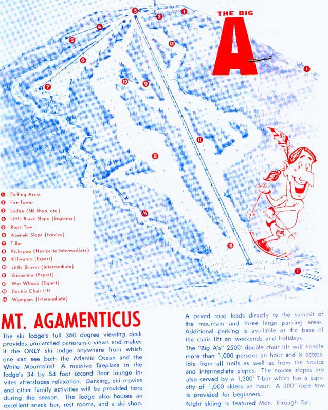
A Snowjournal thread got me thinking about the role of a ski area logo -- those that do the job effectively and those that need to be redesigned. Anyone got favorites or ones they love to hate? Here are some off the top of my head:
There are classic logos that should never be changed:

And there are logos designed during the 70s that really need to be updated:


I like when they show an animal with a goofy grin:

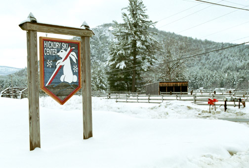
But I don't like when they try to get ambitious and mix metaphors -- combining an animal with the outline of a mountain:

Or a snow flake with a maple leaf (this also falls into the 1970s graphic that needs to be updated):

I was always on the fence with the Whiteface logo, but it's grown on me:

Alta... I don't dislike it, but it's not a favorite:

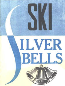
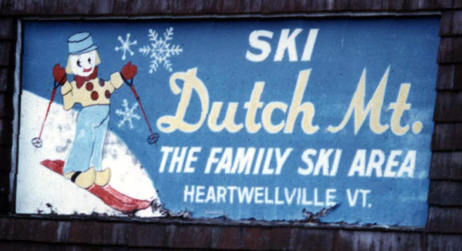
You can spend all day checking out cool oldtime logos from the NELSAP site:
And you have to admire the sheer political incorrectness of logos with half-naked native Americans:

There are classic logos that should never be changed:

And there are logos designed during the 70s that really need to be updated:


I like when they show an animal with a goofy grin:


But I don't like when they try to get ambitious and mix metaphors -- combining an animal with the outline of a mountain:

Or a snow flake with a maple leaf (this also falls into the 1970s graphic that needs to be updated):

I was always on the fence with the Whiteface logo, but it's grown on me:

Alta... I don't dislike it, but it's not a favorite:

You can spend all day checking out cool oldtime logos from the NELSAP site:


And you have to admire the sheer political incorrectness of logos with half-naked native Americans:
